Brand Guidelines
This guide lays out the look, feel, and simple rules that keep the Shed Suite brand clear and consistent — no matter where it shows up.
This guide covers the everyday standards that bring our brand to life, so everything we put out there feels unmistakably like us.
Whether it's a website or event partnership, these guidelines make sure every piece reflects the Shed Suite brand.
Contents
01 Logo
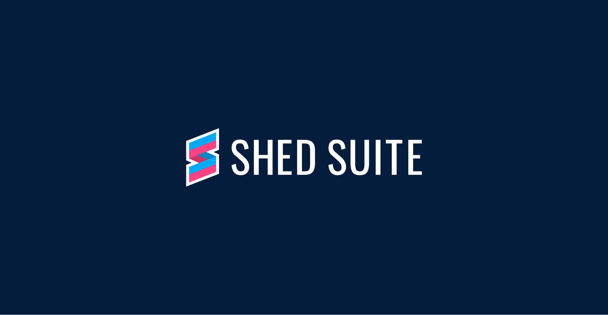
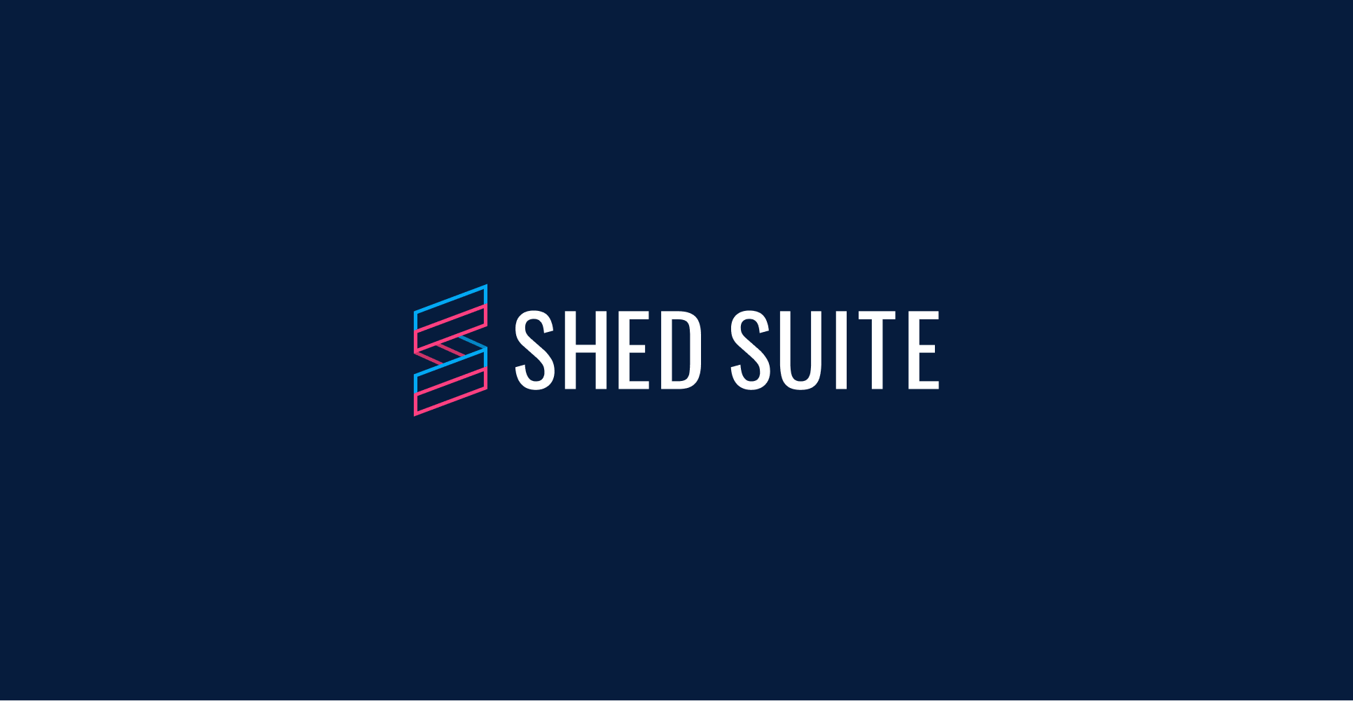
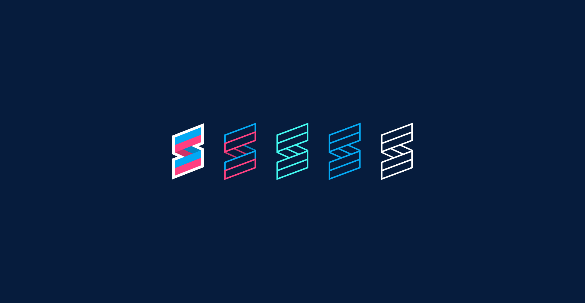
The Shed Suite logo is an "S" built from the wood and metal siding you'd find on a real shed. It's a nod to the materials our customers work with every day, grounding our software in the industry we actually serve, not some abstract tech idea.
The clean lines keep it modern and easy to spot, and it works just as well on a phone screen as on a shop sign, but that siding texture keeps it honest and rooted in the trade. Our deep blues carry the trust and dependability shed businesses count on, with a bold pop for the energy behind every build.
More than a logo, that "S" stands for what we do — the operating system behind 2,800+ shed businesses, from first click to five-star review. Made for the people who show up and build.
Primary Lockup Dark BG
Secondary Lockup Light BG

Outlined Lockup
Icon Options
Partnership Lockups
02 Color
Shed Suite's palette is built on blue — calm, steady, and trustworthy — so every screen and every ad reflects the dependability our customers count on to run their business.
Deep blues keep the app grounded and easy on the eyes, while bold blues bring the energy to our marketing. Teal and pink show up sparingly — just enough pop to highlight what matters.
Primary Palette
Deep Blue
Hex: #061C3D
Cerulean
Hex: #03A9F4
White
Hex: #FFFFFF
Secondary Palette
Teal
Hex: #42F9F0
Pink
Hex: #FF4081
03 Typography
Our typography pairs clarity with approachability through two purpose-built sans-serifs, backing our commitment to readability, precision, and dependable communication.
Primary Sans-Serif (Lexend) is a clean, modern typeface engineered for readability, built on research into how people read. Its open spacing and distinct letterforms cut reading fatigue and keep every word clear, making it the ideal choice for headlines, brand moments, and marketing that must land fast.
Secondary Sans-Serif (Inter) is a precise, screen-first typeface built for interfaces and small sizes. Its tall x-height and open shapes keep information legible at a glance, making it the workhorse for our product, dashboards, reports, and body text, where clarity matters most.
Together these two sans-serifs form a clear, dependable system, Lexend's readable warmth for the brand and Inter's precision for the product, keeping our communication approachable and confident.
Primary Typeface
Lexend
Secondary Typeface
Inter

© 2026 Shed Suite LLC
All Rights Reserved